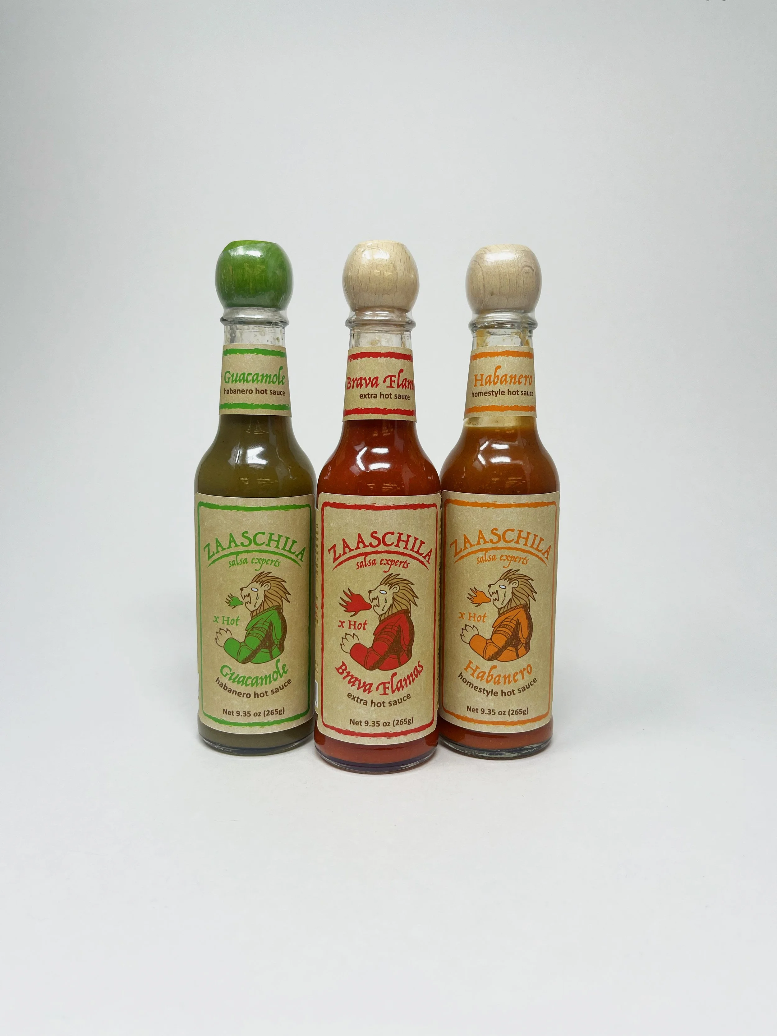
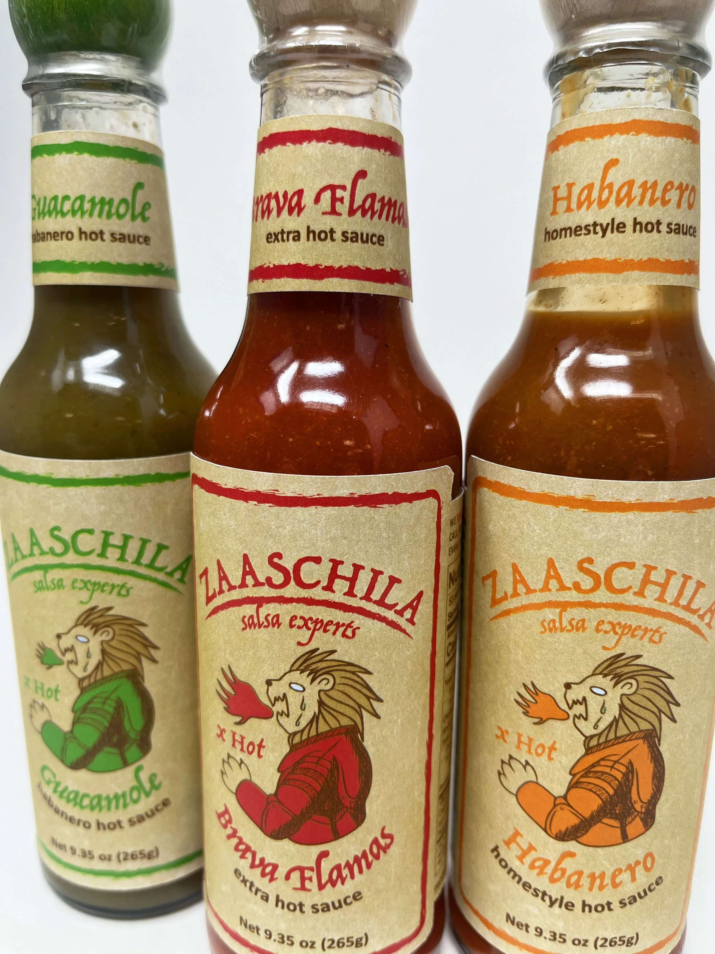
Zaaschila Salsa Bottles
This packaging redesign reinterprets Zaaschila salsa through a medieval-inspired visual language, creating a bold and distinctive brand identity. The project includes packaging for three salsa varieties, designed as a cohesive range with subtle visual differentiation.

Medieval influences appear through textured labels, hand-drawn illustrations, and rough outlines, all organised within a clear layout system that balances readability with an expressive character.
BEFORE
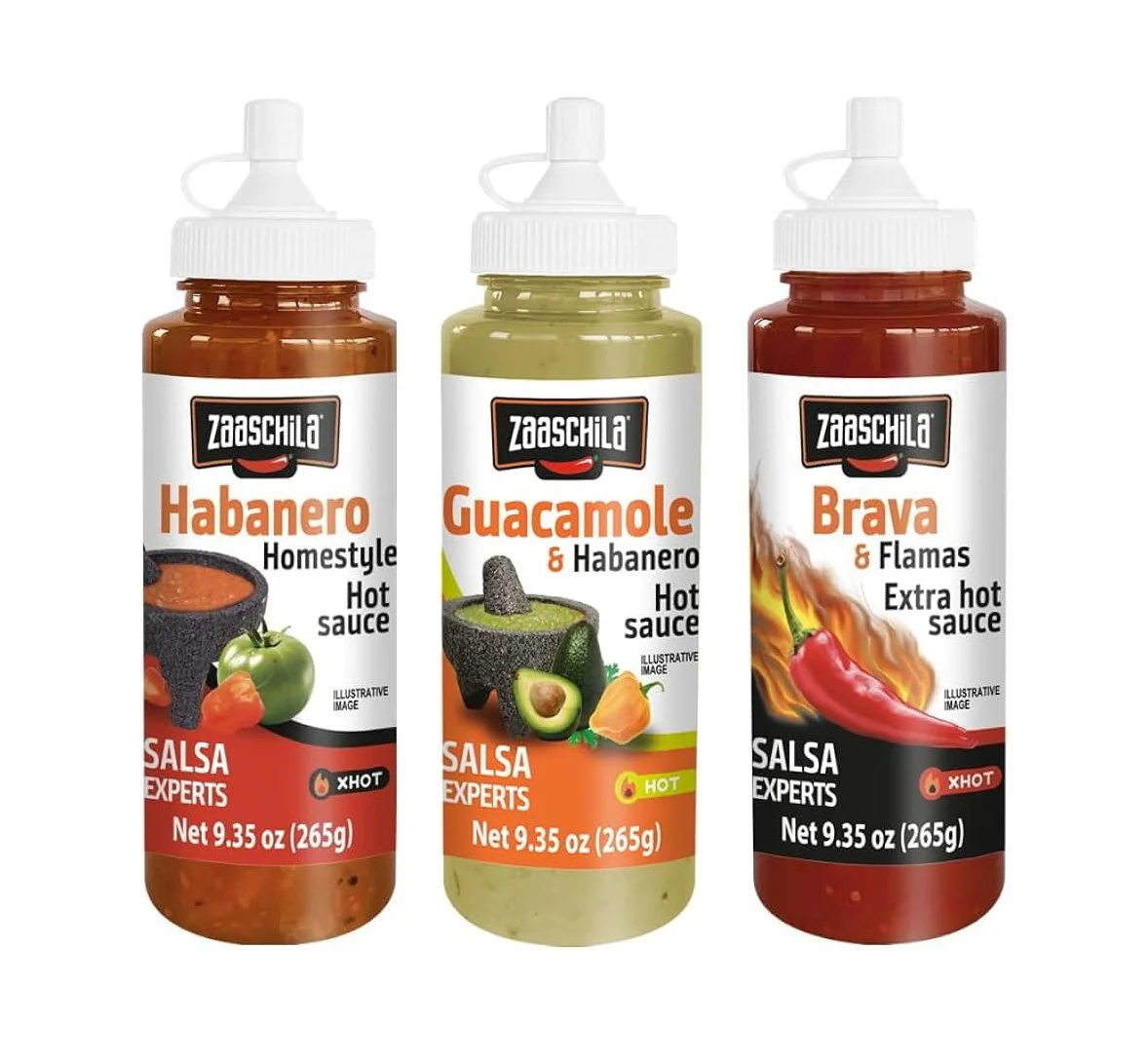
AFTER